
Case study: Serving up a brand that’s beyond imagination
When “just like everyone else” won’t cut it.
If you’ve ever gone Googling for a caterer, you’ll know exactly what we mean by sea of sameness. Literally thousands of results, all with the same sub-par, pixellated photography, white and black templates, and bad SEO copy. Appetite lost.
Essential Catering & Events had extraordinary food, elevated service, and access to some of Melbourne’s most special venues, but their brand didn’t shout that. It whispered. Our brief was loud and clear: ensure they stand out in a way that's impossible to ignore.
Ditching beige for blood orange (and a whole lot more).
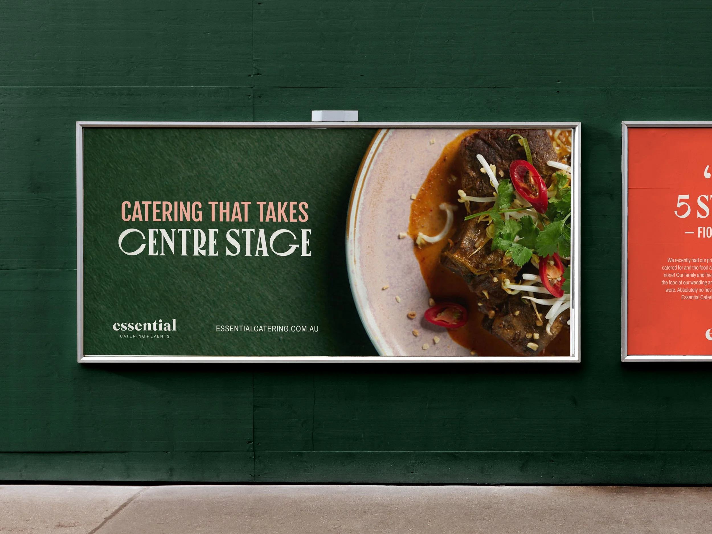
We started out by establishing their value proposition: Experiences Beyond Imagination. Spending time with the Essential team, getting to know them, understanding their drivers, values and aspirations, it became clear that they create so much more than just food and events. From there, the creative concept took shape: The Theatre of Food.
We were inspired by the vision of every dish taking centre stage, every guest becoming part of the performance, and every event unfolding like a beautifully choreographed show. Why should caterers be stuck with polite plates when they could own the drama, the flavour, and the spectacle?
Cue dramatic colour palettes (kale greens, blood oranges), curtain-like motifs that frame every image like the opening act, editorial layouts, food photography that makes you salivate. Typography with personality. Visual storytelling. Every detail dialled up, because this wasn't about fitting in, it was about standing up and grabbing attention.


Flamboyance is nothing without ROI.
This wasn’t just design for design’s sake. It was a commercial play: to cut through the average, attract the right kind of inquiries, and position Essential Catering & Events as the go-to caterer for couples, corporates, and anyone planning an unforgettable event in Melbourne.
We aligned every decision, from colour and imagery to layout and typography, to support that. No fluff. Every detail is a tool to build trust, make first impressions count, and turn website visitors into leads who believe they’re investing in more than food, they’re investing in an experience.


Awards on the shelf, bookings in the calendar.
Turns out people noticed. The new brand is sophisticated, full-flavour, and impossible to ignore.
Essential’s internal team said they felt “moved to new ground.”
Prospective clients began citing the brand as the reason they reached out.
Others in the events industry commented on how much they notice Essential because of the distinctive branding.
And then the industry bells rang. The 2025 Global Indigo Design Awards honoured the rebrand with 5 × Gold, 2 × Silver, plus a shortlist placing for Brand Design of the Year.
Why this one’s different.
Because it didn’t settle. Because it asked “why not” at every turn. Because Essential no longer looks like a template, they look like a destination.
We didn’t just whip up a new logo for Essential Catering & Events and leave it at that. We reinvented what a premium catering brand can be. A brand that delivers flavour in more than just the food, it delivers in every pixel, every social media interaction and every aspect of the client experience.
🎨 At Little Village Creative, we build category-busting brands for businesses of all shapes and sizes. Why? Because marketing like your competition doesn’t make you money.
Interested to see what we could do for you? Get in touch here.